Trade Show Booth Design for B2B: The Engineering Playbook
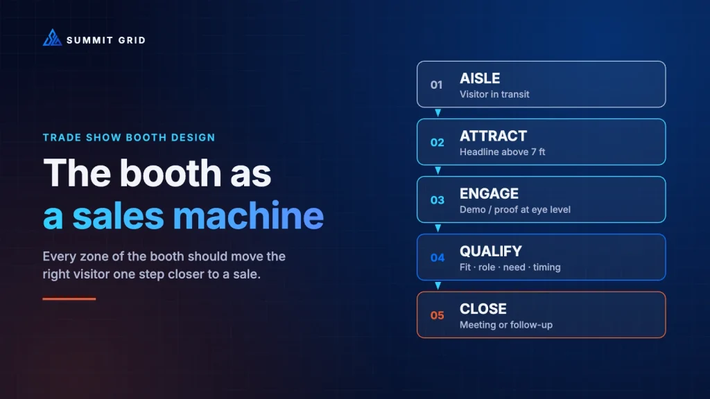
Most booth design advice is written for brand awareness: make it bold, make it bright, make it memorable. That advice is not wrong, but it is incomplete for B2B companies. When a single enterprise deal can be worth more than the entire show budget, a booth is not a billboard. It is a piece of sales infrastructure that has to perform under very specific physical conditions: crowded aisles, harsh hall lighting, noise, fatigue, and only a few seconds in which a buyer decides whether to stop.
This playbook treats trade show booth design as an engineering problem. It walks through the decisions that actually change outcomes, in the order you should make them, from the business goal down to the last print file.
Key takeaways
- Start from the sales outcome, not the render. A booth should be designed backwards from the conversations it needs to create.
- Traffic flow and sightlines decide performance more than finishes do.
- Graphics must be readable over a crowd at 20 feet, and print files must be built to the fabricator’s template.
- Measure the right things during the show so you can prove ROI afterwards.
Why B2B trade show booth design needs a different brief
B2B exhibitions are not a side channel. According to the Center for Exhibition Industry Research’s 2026 marketing spend report, exhibitors put 40.8% of their marketing budgets into B2B exhibiting, making it their single largest channel (Trade Show Executive, May 2026). The same research notes that management judges exhibitions mainly on sales metrics: lead volume and closed deals after the show.
That is the core difference. A consumer brand can succeed with reach alone. A B2B exhibitor succeeds when the right people have the right conversations, and those conversations turn into pipeline. Every design decision should be tested against one question: does this help a qualified buyer find us, understand us, and talk to us?
That shifts the brief in three ways:
- Fewer, better visitors beat more visitors. A booth that pulls in crowds of students and competitors can look successful and perform badly.
- The booth has to support different conversation depths. A 30-second qualifier at the aisle, a 10-minute demo, and a 40-minute executive meeting all need their own space.
- Credibility matters more than spectacle. Engineers, procurement teams and CIOs want evidence. Readable proof, such as case studies, specs and live demos, often out-performs pure atmosphere.
Step 1: Design backwards from the sales outcome
Before anyone opens a 3D modelling tool, write down what a successful show looks like in numbers. For example:
- 120 qualified conversations with target accounts
- 25 booked follow-up meetings
- 8 executive meetings held in the booth
- 3 live demos per hour at peak times
Research summarised by several exhibitor studies suggests teams that set measurable goals before the show report meaningfully better outcomes than teams that do not (ShowHero, State of Trade Shows 2026). The exact uplift varies by study, but the logic is simple: you cannot design a space for an outcome you have not defined.
Those numbers translate directly into space requirements:
| Outcome | What it needs physically |
|---|---|
| Qualified conversations at the aisle | Open front edge, 2–3 standing points, clear “who we help” messaging |
| Live demos | Screens at the right height, room for 3–6 people to watch without blocking the aisle |
| Executive meetings | An enclosed or semi-enclosed room, acoustic separation, seating for 4–6 |
| Lead capture | A defined spot for scanning badges and noting qualification, not a crowd at the counter |
If your goals include executive meetings and your plan has no meeting room, the design has already failed, no matter how good it looks.
Step 2: Choose the right footprint for your trade show booth design
Booth types are not just size options; each has different rules and different strengths. The most widely used North American rulebook is the IAEE Guidelines for Display Rules and Regulations, which many organisers adopt in their exhibitor manuals (IAEE guidelines, 2019 North American update).
Inline (linear) booths, such as a 10×10 or 10×20, sit in a row with neighbours on each side. Under IAEE line-of-sight rules, full height (typically up to 8 ft) is allowed only in the rear half of the space; everything in the front half is restricted to 4 ft so neighbours are not hidden. That means your key message must live on the back wall, above head height, and your front half must stay open and inviting.
Peninsula booths are open on three sides. They offer far more visibility, but back walls are restricted where they meet neighbouring inline booths, so check your manual carefully.
Island booths, such as a 20×20 or larger, are open on all four sides and typically allow structures of 16–20 ft including signage, subject to the organiser’s rules. Islands are where you can build hanging signs, double-decks, theatres and private rooms, but they also demand a strategy for four frontages, not one.

Always read the specific show’s exhibitor manual before design starts. Height limits, hanging sign rules, fire regulations and double-deck approvals vary between venues and change over time.
Step 3: Plan traffic flow before you plan finishes
Visitors do not wander randomly. They follow the aisle, react to what is at eye level, and stop where it feels easy and safe to stop. A good booth plan controls three movements:
- Entry. Where does someone step off the aisle? Make it obvious and wide. Tables or counters placed right at the front edge act as barriers.
- Engagement. Where does the conversation or demo happen? Place demos where watchers can gather without blocking the entry.
- Exit or escalation. Where does a good conversation go next? Ideally deeper into the booth: to a meeting space, a quieter demo, or a place to book a follow-up.
Common mistakes that kill flow:
- The counter wall. A reception counter across the full front edge tells visitors “you are outside.”
- The demo bottleneck. A screen at the entry draws a crowd that stops anyone else coming in.
- The empty centre. Large open floor areas feel exposed; people hesitate to walk into the middle of a space with nothing in it.
- Dead corners. Corners that are hard to reach tend to become storage, which is fine, as long as that was the plan.
We model flow in 3D before any graphics are designed, because moving a demo station two metres on a model is free, while moving it on show day is impossible. You can read more about how we approach this on our Capabilities page and in our booth layout guide.
Step 4: Design for sightlines, not renders
Renders are usually shown from a high, empty angle. Visitors see your booth from 5 ft 6 in, over the heads of a crowd. That changes everything about where information should go.
In busy halls, anything printed below chest height effectively disappears behind people and bags. We wrote about this in detail in The 4-Foot Visibility Dead Zone. The practical rules are:
- Put your brand and one-line value proposition above 7 ft so it reads over a crowd.
- Use hanging signs or tall fascias on island booths; they are often the only element visible from across the hall.
- Keep headline copy short enough to read in two to three seconds while walking.
- Put detailed information, such as case studies, specs and diagrams, inside the booth at eye level, where people have already stopped.
That last point matters more than it seems. At CES 2025, trade press noted that Siemens used in-depth physical signage with case studies inside its booth, and that attendees actually stopped to read and take notes (Event Marketer, CES 2025 recap). The lesson: long-form content works when it is placed where people are already standing still.
Step 5: Build a screen and LED strategy
LED walls are now standard on mid-size and large booths, and they are expensive. Getting value from them means treating them as part of the architecture, not as a TV hung on a wall.
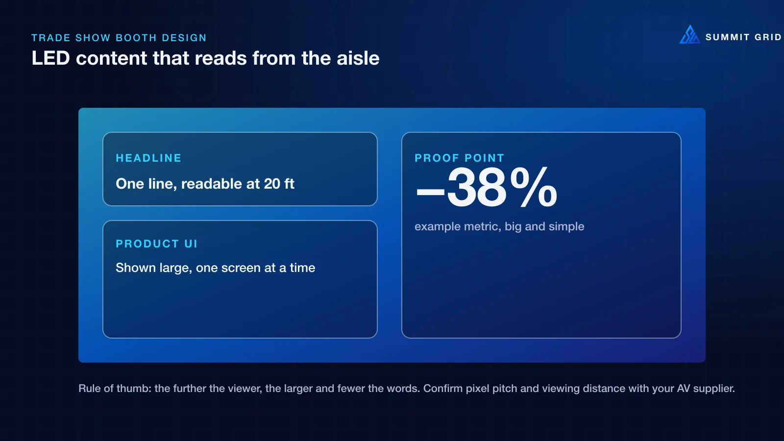
- Content, not showreels. Loops of brand video are easy to ignore. Short, legible statements, product UI shown at readable scale, and live data tend to work better.
- Legibility at distance. Text on an LED wall must be large enough to read from the aisle, typically at 20 ft. Small UI screenshots do not work at that range.
- Pixel pitch and viewing distance. The closer visitors stand, the finer the pixel pitch you need. Ask your AV supplier for recommended viewing distances for the product you are renting.
- One visual system. The same colours, type and layout rules should run across the booth wall, the LED content and the keynote deck, so the brand does not fracture between the stand and the stage.
Step 6: Engineer the print files
Print is where good designs quietly fail. The most common problems we see are wrong sizes, low-resolution images and colour shifts. Each has a well-understood fix:
- Build to the fabricator’s template. Tension-fabric (SEG) graphics need extra material on every edge for the silicone bead. Fabricator guidelines commonly ask for bleed on all sides and a safe zone of around 2 in for text and logos (SEG Solution artwork guidelines).
- Check effective resolution at full size. Large-format graphics viewed from a few feet away typically need around 100–150 DPI at final size; web images rarely hold up.
- Define print values for brand colours. RGB colours approved on screen can shift on fabric. Specify CMYK and, where needed, Pantone values, and request a physical strike-off.
- Use a proper rich black. A pure K black on fabric often looks grey under hall lighting. We explain the fix in CMYK Rich Black: The $15,000 Venue Reprint Trap.
Our guide to SEG fabric graphics covers print specifications in full detail.
Step 7: Give every conversation depth a home
A strong B2B booth has distinct zones for distinct conversations:
- The aisle edge: one or two staff positioned to greet and qualify, with a short question that sorts visitors quickly.
- Demo points: screens or physical products at standing height, with space for small groups.
- The deep zone: a meeting room or semi-private lounge for scheduled executive meetings and serious buyers.
Private meeting space is increasingly common on large stands. At CES 2025, Siemens’ 50×70 ft booth included a separate VIP entrance upstairs with three private meeting rooms (Exhibitor, Best of CES 2025). You do not need a double-deck to apply the idea: even a 20×20 island can hold a glazed meeting pod with acoustic panels.
Step 8: Plan measurement into the design
If ROI is judged on leads and closed deals, the booth has to make measurement easy:
- Choose lead retrieval that lets staff tag qualification on the spot, not just scan badges.
- Decide in advance what counts as a qualified lead, and train staff on it.
- Track demos delivered and meetings held, not just scans.
- Agree with sales how follow-up will happen, and how quickly.
Industry benchmarks for cost per lead at trade shows vary widely, from roughly $100–$300 in some studies to several hundred dollars or more for premium events (Momencio benchmark data). The figure that matters for your business is cost per qualified lead, which is always higher than the raw number. We cover this in depth in our guide to trade show ROI.
Trade show booth design ideas that work for B2B
Ideas are easy to find; ideas that suit a B2B sales motion are rarer. These consistently earn their place in a B2B trade show booth design:
- A one-line promise at 8 ft or higher. Not a slogan, but a clear statement of who you help and how, such as “Predictive maintenance for rail fleets.” Visitors decide in seconds whether you are relevant.
- Proof at eye level. Short case studies, customer logos (with permission), certifications and performance numbers placed where people have already stopped.
- Live product, not just video. Hardware on a plinth, software on a touchscreen, or a working model. Buyers trust what they can touch or operate.
- A visible demo schedule. A small board or screen showing “next demo at 11:30” builds small audiences at predictable times.
- A semi-private meeting space. Even a glazed pod with two chairs signals that serious conversations happen here.
- Consistent visual language. The booth, LED content, printed collateral and keynote slides should look like one brand, not four suppliers’ interpretations.
- Lighting on the message. Hall lighting is often flat. Lighting your headline and product makes them stand out from across the aisle.
Ideas that often disappoint in B2B settings include large giveaway areas (they attract the wrong visitors), generic brand videos on loop, and complex interactive games that take longer to explain than to play.
Where to spend (and save) in your trade show booth design budget
Budget decisions shape design as much as creative ideas do. Some practical guidance:
- Spend on visibility. Hanging signs, a strong headline and good lighting make the rest of the investment work.
- Spend on demo quality. A reliable screen, good audio control and a fast, rehearsed demo matter more than extra square footage.
- Spend on print pre-flight. A few hours of file checking prevents reprints that cost far more.
- Save with modular hardware. Frames and structures that reconfigure between booth sizes spread cost across several shows.
- Save on unused space. Do not rent a larger footprint than your conversation goals require.
- Save on shipping. Lighter structures and fabric graphics reduce freight and handling costs.
A simple pre-flight checklist
Before files go to print and the stand goes to build, run through this list:
- Business goals are written down and translated into space requirements
- Booth type rules (heights, line of sight, hanging signs) checked against the exhibitor manual
- Traffic flow modelled: clear entry, demo space that does not block it, a deep zone
- Headline and brand placed above 7 ft; detail placed inside at eye level
- LED content designed for legibility at 20 ft
- All print files built to the fabricator’s template with correct bleed and safe zones
- Brand colours specified in CMYK/Pantone; strike-off approved
- Lead qualification and measurement plan agreed with sales
Frequently asked questions
How far in advance should B2B trade show booth design start?
For a custom island, three to six months is typical, and more for complex builds or shows with strict approval processes. Inline booths using existing hardware can move faster, but print and approval deadlines still apply.
Is a bigger booth always better?
No. A well-planned 10×20 can out-perform a poorly planned 20×20. Size should follow the number and type of conversations you need to hold.
Should we use LED walls or printed graphics?
Usually both. Printed graphics are best for the fixed brand message and wayfinding; LED is best for motion, product UI and changing content. The key is one consistent visual system across both.
What is the most common booth design mistake?
Designing from the render rather than from the visitor’s eye level. Messages placed low, counters that block entry, and unreadable small text are the usual results.
How do we know if the booth worked?
Compare results against the goals you set before the show: qualified conversations, meetings held, demos delivered, and ultimately pipeline and closed deals attributed to the event.
Planning your next show? Book a free 15-minute Visual Audit and we will review your current 3D drafts against these principles before anything goes to print.