ISEM Global Partners: From Rebrand to Exhibition Booth, Banners and Print
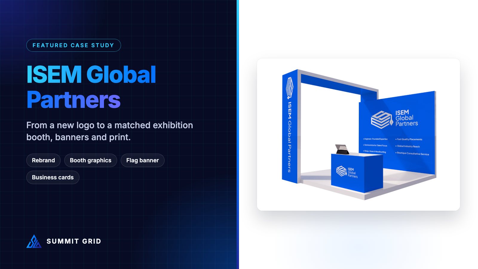
ISEM Global Partners needed more than a new logo. They needed a brand that would look exactly the same on an exhibition booth, a flag banner in the aisle, a business card in someone’s pocket and a billboard across the street. This case study shows how we built that system, and how the same blue made it from screen to every printed surface.
| Client | ISEM Global Partners (education and specialist talent) |
| Scope | Rebrand, brand guidelines, exhibition booth graphics, flag banner, business cards, tote bags, pin badges, billboard, app icon, web header |
| Brand colours | Blue #0064FF · White #FFFFFF · Grey #595959 |
| Typeface | Plus Jakarta Sans |
| Designer | Muhammad Awais Shabbir, Summit Grid |
The challenge: a brand that has to work in a busy hall
ISEM Global Partners helps people move forward in their careers and education, from guiding students toward study abroad to finding specialist talent for engineering and semiconductor teams. Like most service businesses, a big part of their marketing happens face to face: education fairs, recruitment events and industry exhibitions.
That is where weak branding gets exposed. On a website, a slightly different blue on two pages is easy to miss. In an exhibition hall, the booth, the banner, the staff, the brochures and the giveaways all sit side by side under the same lights. If they do not match, visitors notice straight away, even if they cannot say why. The stand looks less organised, and the business looks smaller than it is.
So the brief had two parts:
- Create a new identity that clearly says “education and growth” and is simple enough to read from across an aisle.
- Turn that identity into a full set of event collateral that would look like one family on the day: booth, flag banner, business cards, bags, badges and outdoor advertising.
Step 1: a logo built for distance, not just for screens
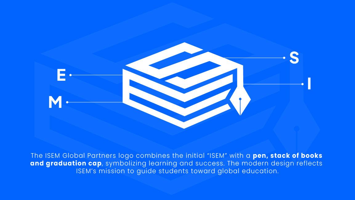
The new ISEM mark combines the letters of the name with a stack of books, a graduation cap and a pen nib. Those three ideas, learning, achievement and writing your own future, sum up what the company does in one shape.
We tested the mark at the sizes it would actually be seen at an event, not only at the size of a laptop screen:
- Large: 3 to 4 metres wide on a booth wall, viewed from 6 metres or more away.
- Medium: on a tall flag banner moving slightly in the air conditioning.
- Small: on a business card, a pin badge and a phone app icon.
Thick, simple shapes held up at every size. That matters because an exhibition logo only gets a brief glance from someone walking past. If you want the science behind this, our runbook on the 4-foot visibility dead zone at GITEX explains why logos and key messages need to sit high and stay simple.
We also built linear, stacked and icon-only versions of the logo. Each format of event collateral has a different shape. A tall flag banner needs the stacked version, a wide table drape needs the linear one, and a pin badge only has room for the icon.
Step 2: one blue, locked into a colour spec
The main brand colour is a bright, confident blue: #0064FF. On screen, it looks great. In print, bright blues like this are risky. Many of them sit outside what normal CMYK printing can reproduce, so printers convert them automatically. That can push them toward purple or make them look flat and dull.
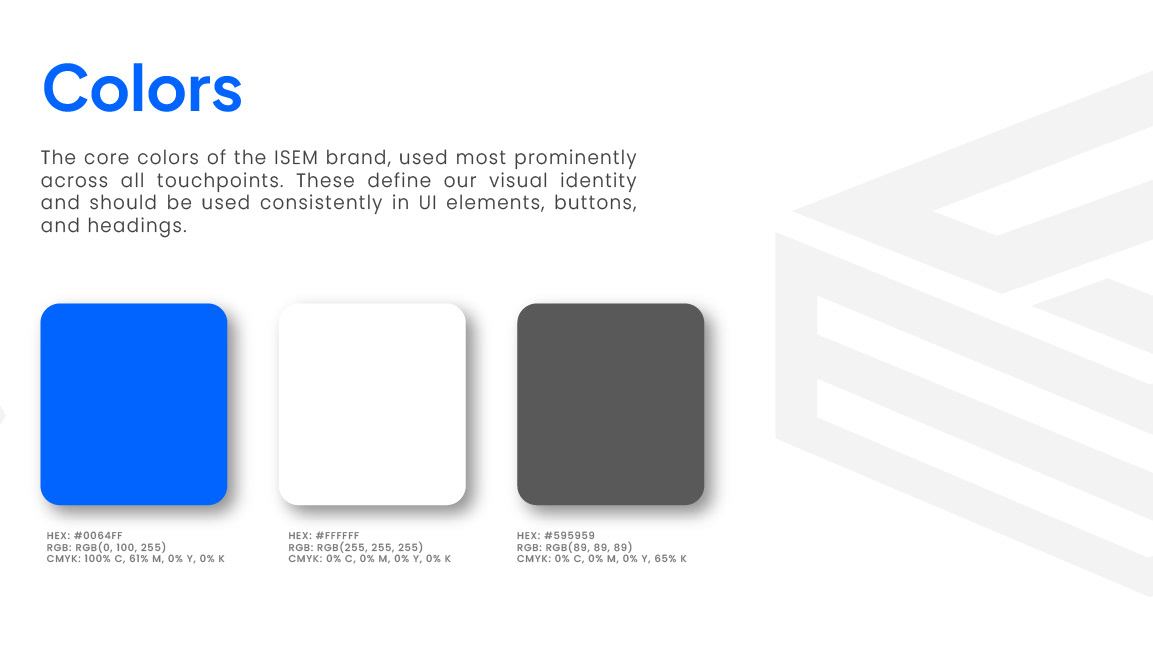
To stop that from happening, we wrote every brand colour down in all the formats suppliers need:
| Colour | HEX | RGB | CMYK |
|---|---|---|---|
| ISEM Blue | #0064FF | 0, 100, 255 | 100, 61, 0, 0 |
| White | #FFFFFF | 255, 255, 255 | 0, 0, 0, 0 |
| Grey | #595959 | 89, 89, 89 | 0, 0, 0, 65 |
This one table did more for the event collateral than anything else in the project. Every printer, sign maker and merchandise supplier worked from the same numbers, instead of guessing from a PDF on their screen. If you are curious about what happens when that step is skipped, read our post-mortem on brand blue that printed purple.
For extra control on large fabric prints, it is worth matching your main colour to a Pantone reference and asking the printer for a small test print, called a strike-off, before the full run. A strike-off costs very little. A full reprint at the venue costs a lot.
Step 3: typography that stays readable at every size
The brand uses Plus Jakarta Sans, a clean, modern sans-serif that is free to use and easy for every supplier to get hold of. That last point is important for event work. If a printer or sign company does not have your font, they will often swap it for something similar, and your booth ends up with slightly different lettering from your brochures.
We used bold weights for anything that needs to be read from a distance, like the booth headline and flag banner, and regular weights for close-up print like business cards and leaflets.
Step 4: the exhibition booth
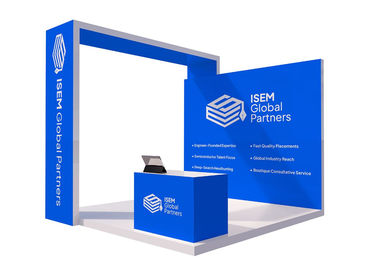
With the logo, colours and type in place, we designed the booth graphics. The layout follows a simple rule: say who you are high up, say what you do at eye level, and keep the floor area open.
- The side tower carries the name vertically, so the brand can be seen from down the aisle before people reach the stand.
- The back wall holds the large logo and six short service points, such as fast quality placements, global industry reach and a boutique consultative service. Each point is only a few words, so it can be read in passing.
- The counter repeats the logo at the front, where people stop and talk.
Everything on the booth uses the same #0064FF blue with white text. The plain colour fields make the stand look bigger and more premium than a busy, photo-heavy design would. They also make colour matching easier, because large flat areas show any colour difference clearly, so there is nowhere for a mismatch to hide.
If you are planning a stand of your own, our 3D booth design page explains how we plan walking routes, sightlines and zones before any graphics are made.
Step 5: the flag banner, for the aisle
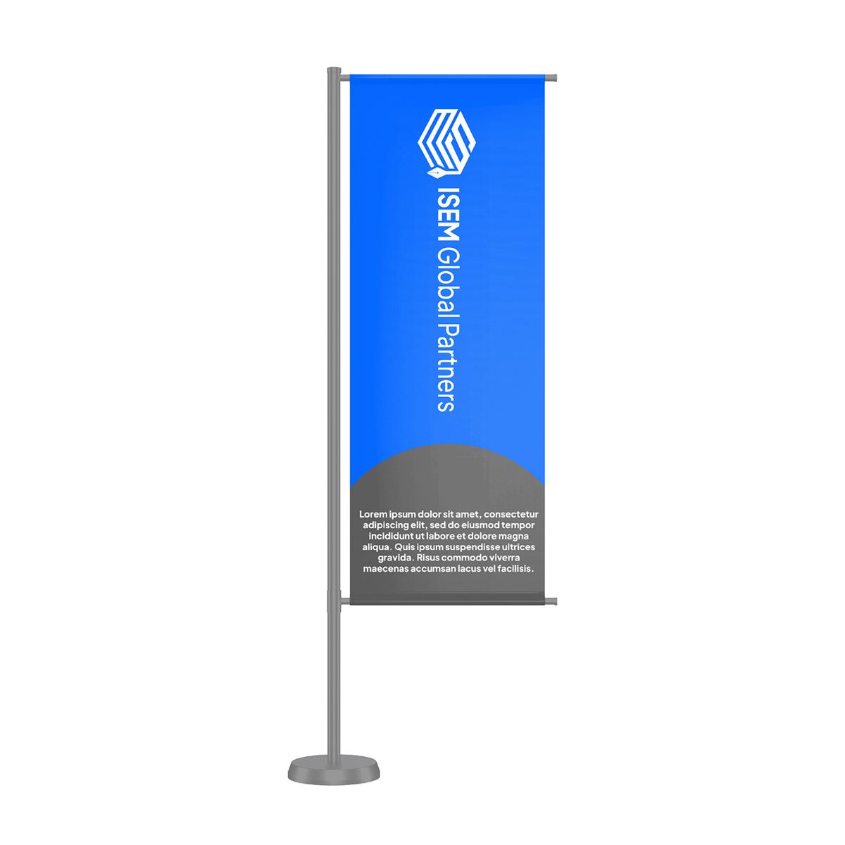
Booths are often hidden by other stands until you are almost in front of them. A tall flag banner fixes that. It rises above the crowd and acts like a signpost.
The ISEM flag banner uses the stacked logo at the very top, where it is most visible, and the company name running vertically. A short block of text sits at the bottom for people who come closer. The same blue, the same font and the same logo proportions as the booth mean it reads as part of the stand, not as a separate advert.
Step 6: business cards and leave-behinds
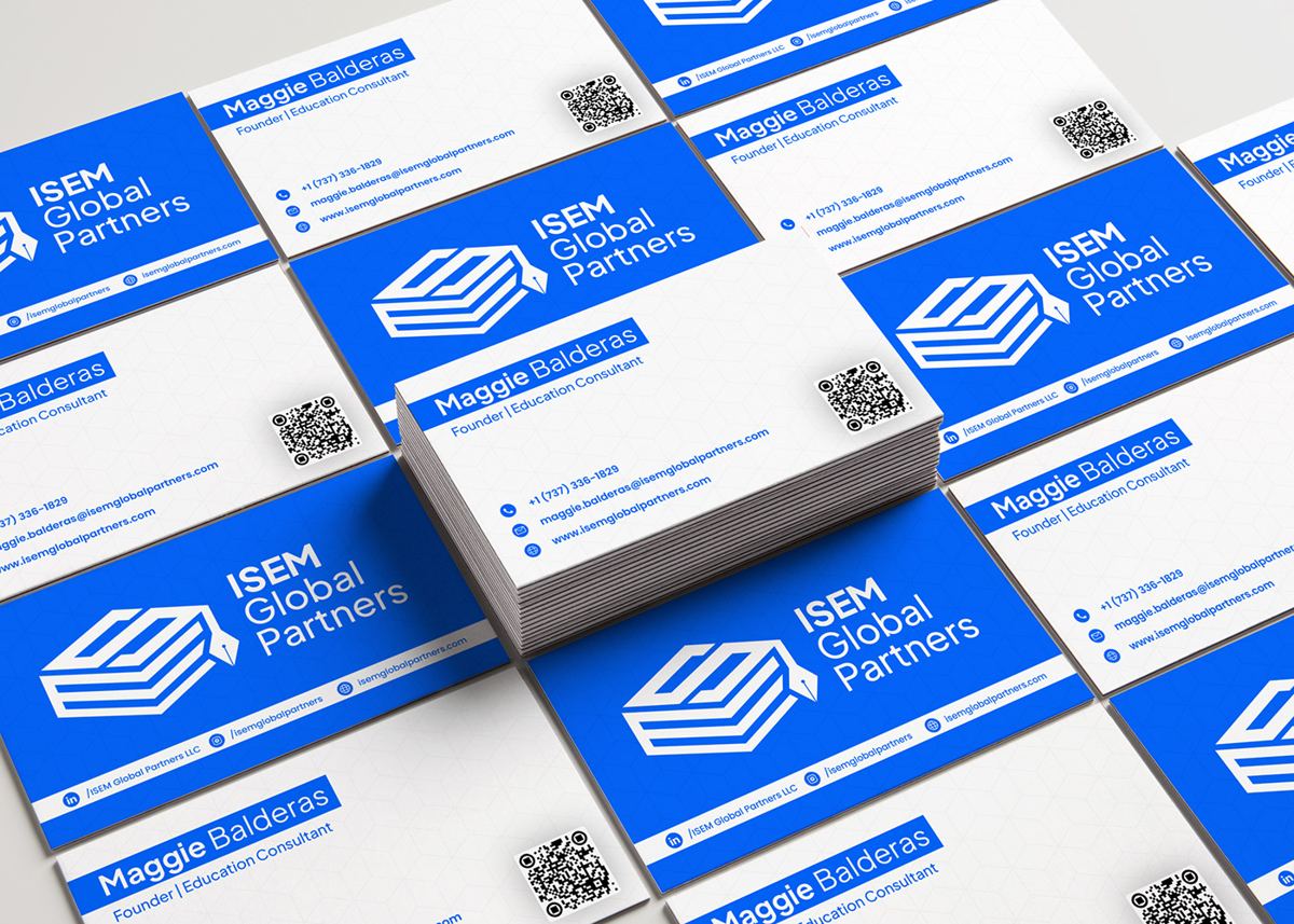
At an event, a business card is often the only thing a visitor takes away that is printed with your name on it. We designed the ISEM cards with:
- A full blue front with the logo, so the card is recognisable even in a pile of 50 others.
- A clean white back with name, title and contact details in the brand font.
- A QR code, so visitors can save the contact or visit the website straight away.
Because the card uses the same CMYK values as the booth, it matches the stand it was handed out from. That small detail helps people remember who they spoke to.
Step 7: merch that people actually keep
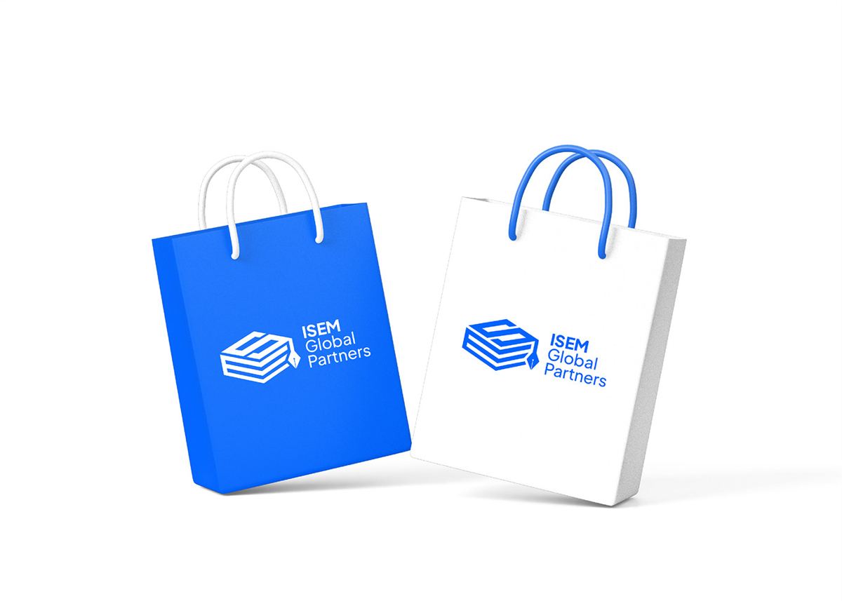
Tote bags are one of the most useful event giveaways. Visitors collect brochures all day, so a good bag gets used immediately and carried around the whole hall. We designed two versions: a solid blue bag and a white bag with a blue logo. Both use the main logo large and centred, so it can be read from a distance.
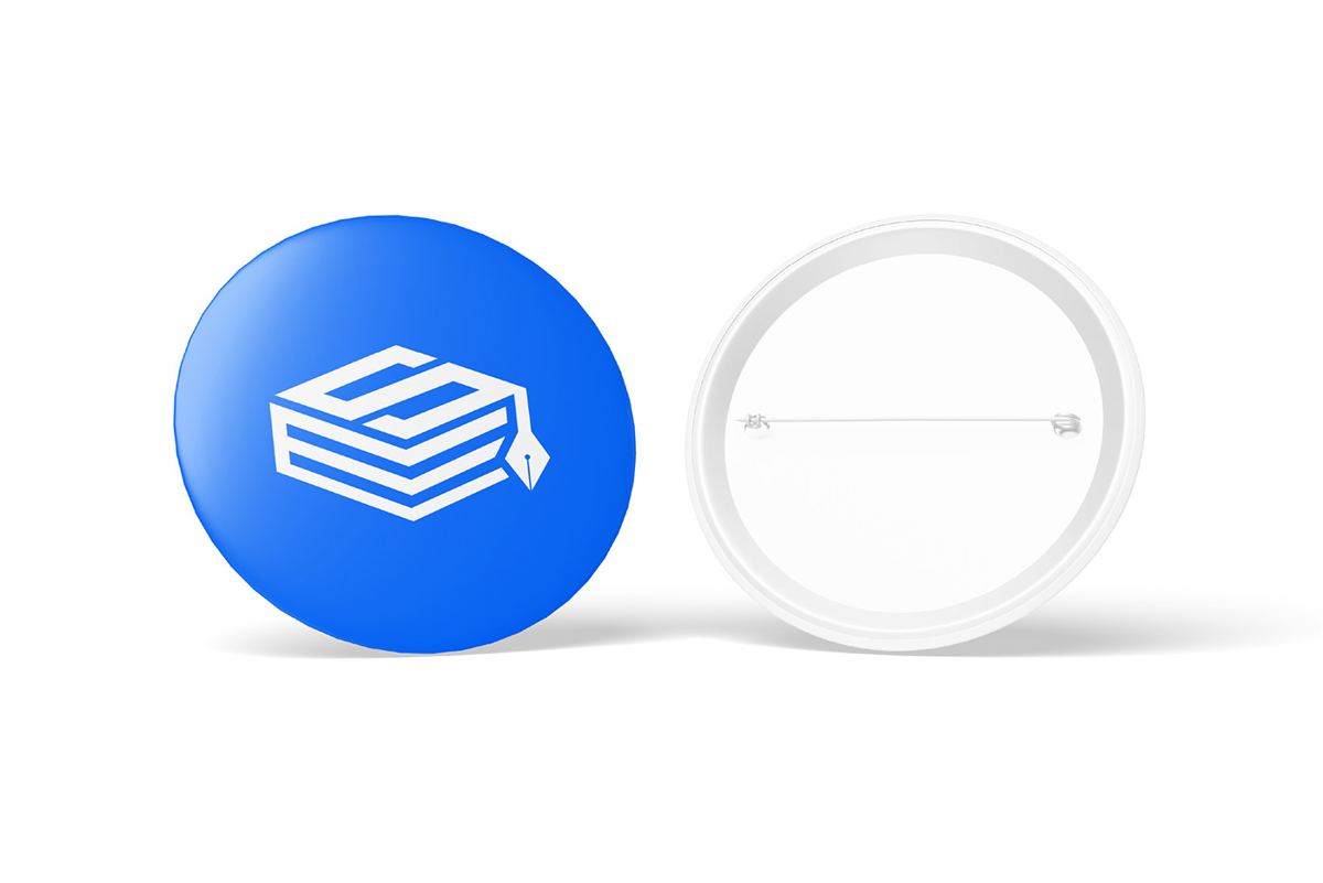
For staff and volunteers, we created round pin badges using the icon-only version of the logo. They are cheap, quick to produce and help visitors spot the team in a crowd. You can read more about staff branding on our event collateral and media page.
Step 8: outdoor and digital, in the same look
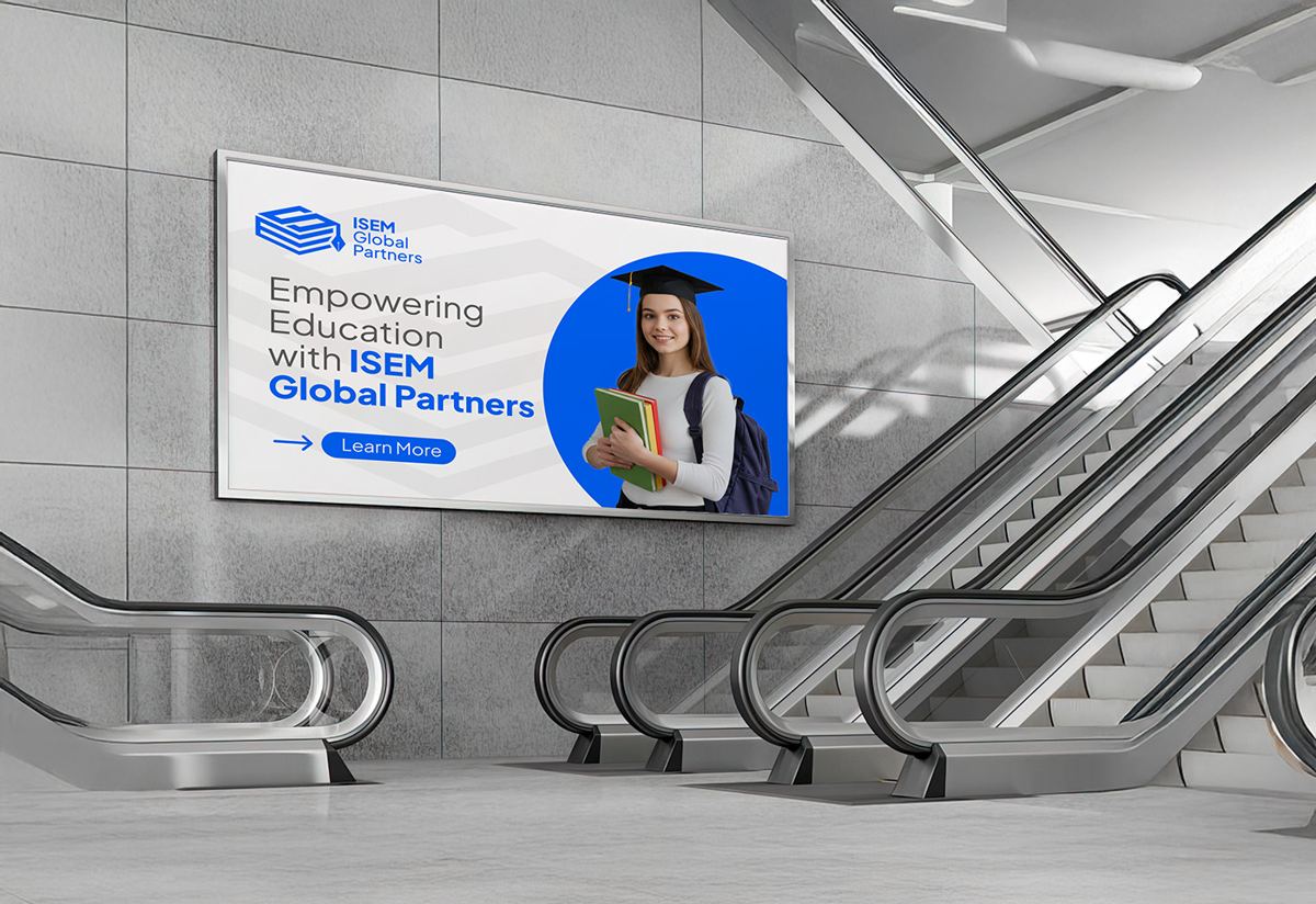
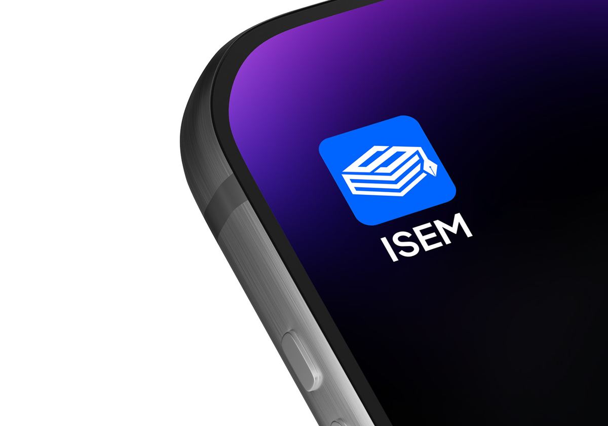
The same system carried through to a billboard with the line “Empowering Education with ISEM Global Partners”, plus an app icon and website header. When someone sees the billboard in the morning and the booth in the afternoon, they connect the two straight away. That repetition is what builds recognition.
What made this project work
Looking back, three decisions did most of the work:
- One colour spec, written down early. Every supplier got the same HEX, RGB and CMYK values before any file was sent. This is the single biggest reason the booth, cards and bags match.
- Logo versions for every shape. Linear, stacked and icon-only versions meant no supplier had to squash or stretch the logo to fit.
- Design for distance first. The booth and flag banner were designed to be read from across the aisle. The close-up pieces were designed after.
How to apply this to your next event
You do not need a full rebrand to get the same result. Most companies already have a logo and colours. What is usually missing is the step that turns those into a matched set of event collateral. Here is a simple checklist:
- Write down your colours in HEX, RGB and CMYK, and ideally a Pantone reference for fabric.
- Make sure your font is available to every supplier, or send outlined files.
- Prepare logo versions for tall, wide and small formats.
- List every touchpoint: booth, roll-ups, flag banners, table drapes, staff shirts, cards, brochures, bags and giveaways.
- Ask for test prints on the real material for anything large.
- Check everything together before the event, not on the day.
Our free 20-foot expo sightline checklist covers the booth side, and our post-mortem on a fabric graphic printed three inches short shows why file sizes matter as much as colour.
Frequently asked questions
How long does it take to create a full set of event collateral?
For a brand that already has a logo and colours, a full set of booth graphics, banners, print and giveaways usually takes 3 to 6 weeks, plus printing time. Starting 6 to 8 weeks before the event is safest.
Why does my brand colour look different on different items?
Different materials and printers handle colour differently. Without one written colour spec with CMYK and Pantone values, each supplier guesses. A shared spec, plus test prints, keeps everything matching.
Which logo version should go on a flag banner?
A stacked or vertical version, placed at the top. Flag banners are tall and narrow, and the top is the part people see over the crowd.
Can you match new event materials to our existing brand?
Yes. That is most of our work. We take your current logo and colours, build the colour spec, and design every event piece to match. See the rest of our work or the Digifloat GITEX Global case study for another example.
See the full ISEM Global Partners project on Behance, or visit isemglobalpartners.com.