Jobulus: Brand Guidelines That Make Every Lanyard, Shirt and Giveaway Match
Jobulus connects companies with top talent and helps job seekers find meaningful careers. A recruitment brand lives at career fairs, hiring events and partner meetings, where staff, lanyards and giveaways do a lot of the talking. This case study shows how one clear brand guideline turned a logo into a full, matched set of event-ready collateral.
| Client | Jobulus (recruitment and careers platform) |
| Scope | Brand guidelines, logo system, colour and type rules, lanyards, staff T-shirts, stationery, business cards, cups, mugs, paper bags, USB drives, stickers, building signage |
| Brand colours | Navy #16243F · Green #01C96C · supporting greens #4EDA99 and #27D182 · off-white #FDF7FA |
| Typefaces | Poppins (primary) · Helvetica Bold (logotype) |
| Design team | Muhammad Awais Shabbir (Summit Grid) and Fazal Rehman |
The challenge: a recruitment brand meets people face to face
Recruitment is a people business. Even when the product is a digital platform, a lot of the trust is built in person: at career fairs, university events, hiring days and meetings with employers. That is where a brand gets seen on the most physical surfaces: name badges, staff shirts, welcome packs, cups at the coffee stand and bags full of leaflets.
Jobulus needed more than a logo. It needed a set of rules that anyone, inside the team or at a supplier, could follow to make every one of those items look like the same brand. Without those rules, the green on the lanyard drifts from the green on the T-shirt, the logo gets stretched on a banner, and the brand slowly loses its shape.
The brief was simple:
- Define the brand clearly, from the logo and its variations to colours, type and how not to use them.
- Show it working on the real items a recruitment brand uses, so suppliers and staff have examples to copy.
Step 1: a brand guideline built for suppliers, not just designers
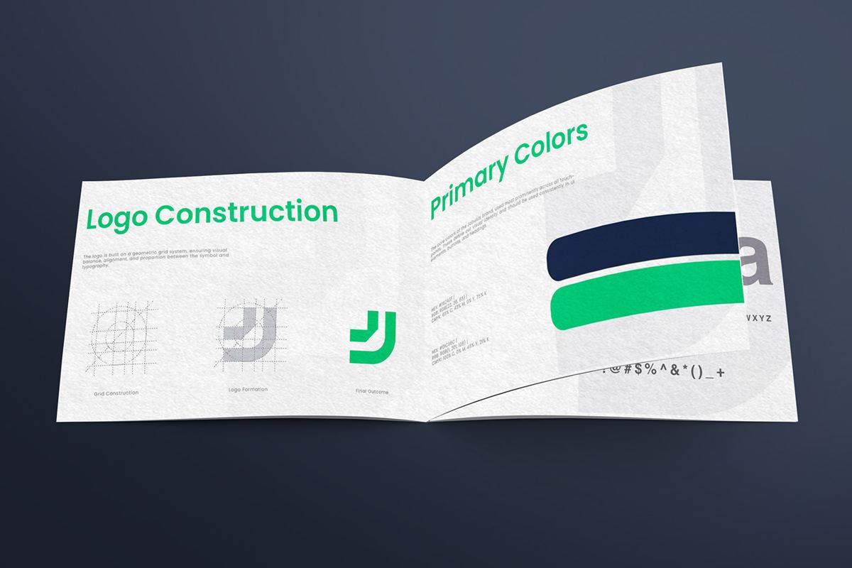
Many brand guidelines are written for designers. They are full of theory and hard to use when you just need to order 500 lanyards. The Jobulus guideline was written to be practical. It is organised into four short chapters:
- Logo: the main logo, variants, construction, safe zone, sizing, use on backgrounds and incorrect usage.
- Colour: primary, secondary and neutral colours, with palettes and tints.
- Typography: the logotype font and the primary font for everything else.
- Applications: how the brand looks on devices, print and merchandise.
It opens with the brand’s purpose: Jobulus stands for trust, opportunity and progress. Starting there helps every later decision. A trustworthy brand needs consistency more than anything else, and consistency is exactly what a good guideline protects.
Step 2: one logo, three versions
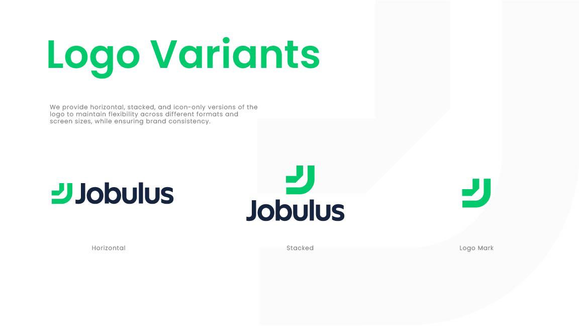
The Jobulus mark is a bold, double “J” shape in green, paired with a clean wordmark. It reads as forward motion, a nod to careers that move ahead. We defined three versions:
- Horizontal: for wide spaces like lanyards, letterheads, table drapes and web headers.
- Stacked: for square or tall spaces like roll-up banners, social posts and bag fronts.
- Icon only: for small spaces like app icons, stickers, pin badges and favicons.
Event collateral comes in every shape imaginable. A lanyard is long and thin, a cup is curved, a sticker is tiny. Having the right version ready for each shape stops suppliers from squashing or cropping the logo to make it fit.
Step 3: rules that protect the logo
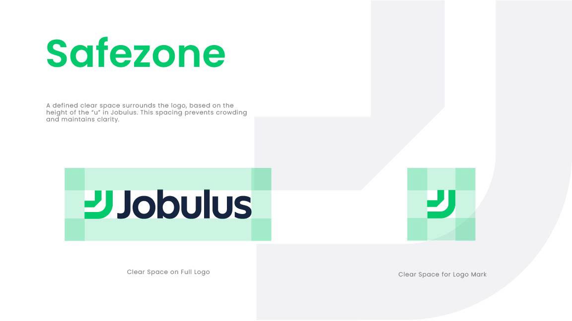
A logo looks strong when it has room to breathe. The guideline sets a safe zone around the logo, based on the height of the J shape, so no text, edge or image crowds it. It also sets a minimum size, so the logo never becomes too small to read on a pen, a USB drive or a mobile screen.
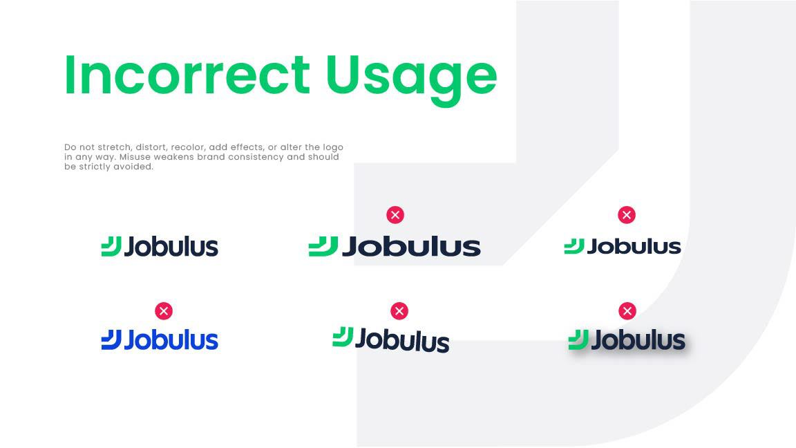
Just as useful is the incorrect usage page. It shows the logo in the wrong colours, stretched, rotated, outlined and with drop shadows. Showing mistakes is often clearer than describing rules. A supplier can look at the page and instantly see what not to do.
Step 4: colours written down in every format
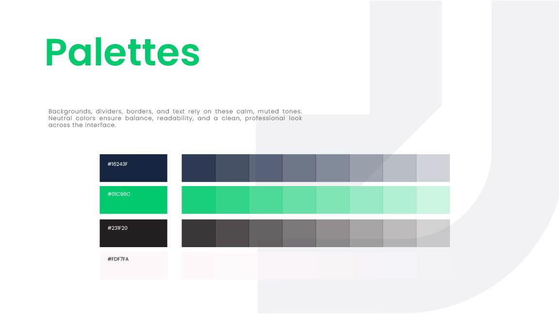
The two core colours are a deep navy and a bright, fresh green. Navy brings trust and seriousness, while green signals growth and opportunity, a good pair for a careers brand. Each colour is defined for screens and print:
| Colour | HEX | RGB | CMYK |
|---|---|---|---|
| Jobulus Navy | #16243F | 22, 36, 63 | 65, 43, 0, 75 |
| Jobulus Green | #01C96C | 1, 201, 108 | 100, 0, 46, 21 |
| Light Green | #4EDA99 | 78, 218, 153 | 64, 0, 30, 15 |
| Mid Green | #27D182 | 39, 209, 130 | 81, 0, 38, 18 |
| Off-white | #FDF7FA | 253, 247, 250 | – |
Bright greens are tricky in print. They often look duller on paper and fabric than on screen. Sharing exact CMYK values, plus asking for a test print on the real material, keeps the green looking fresh on every item. Our post-mortem on brand colours that shift in print explains why this step matters so much.
Step 5: typography that is easy for everyone to use
The guideline uses two typefaces:
- Helvetica Bold for the logotype, giving the name a solid, familiar look.
- Poppins for everything else: headings, body text, signage and merchandise copy.
Poppins is free and widely available, so printers and partners can use it without licensing trouble. That matters for event work, where files often pass through several suppliers in a short time.
Step 6: the brand on event-ready collateral
With the rules in place, the guideline shows the brand on the items a recruitment brand actually uses. Each one follows the same simple pattern: navy as the base, green for the logo and accents.
Lanyards and staff T-shirts
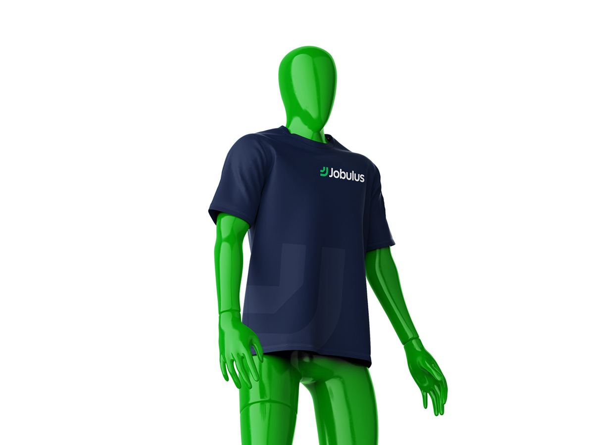
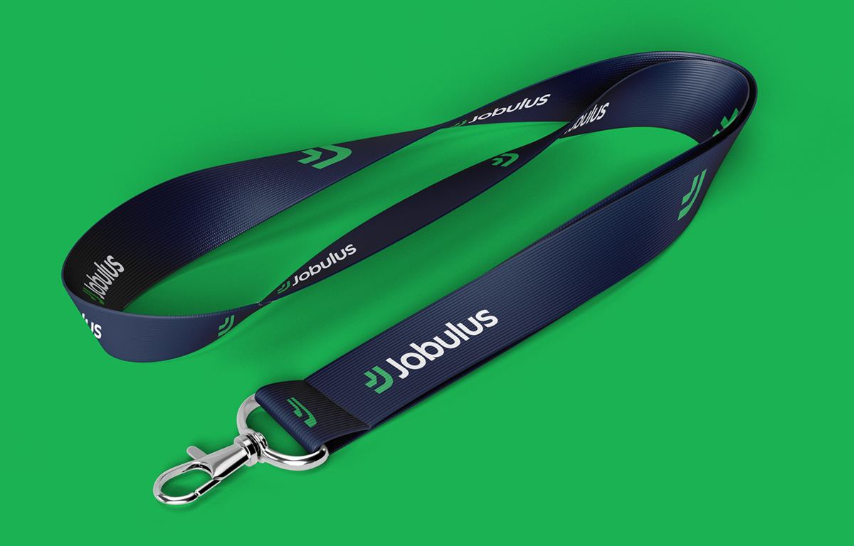
At a career fair, candidates need to know who to talk to. A navy T-shirt with the green logo, worn by the whole team, makes the stand easy to find and the staff easy to approach. The matching lanyard repeats the logo along the strap, so it is visible from any angle. Read more about staff branding on our event collateral and media page.
Stationery and business cards
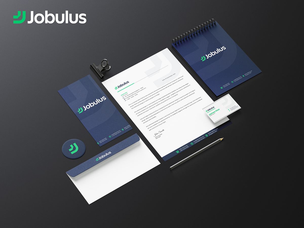
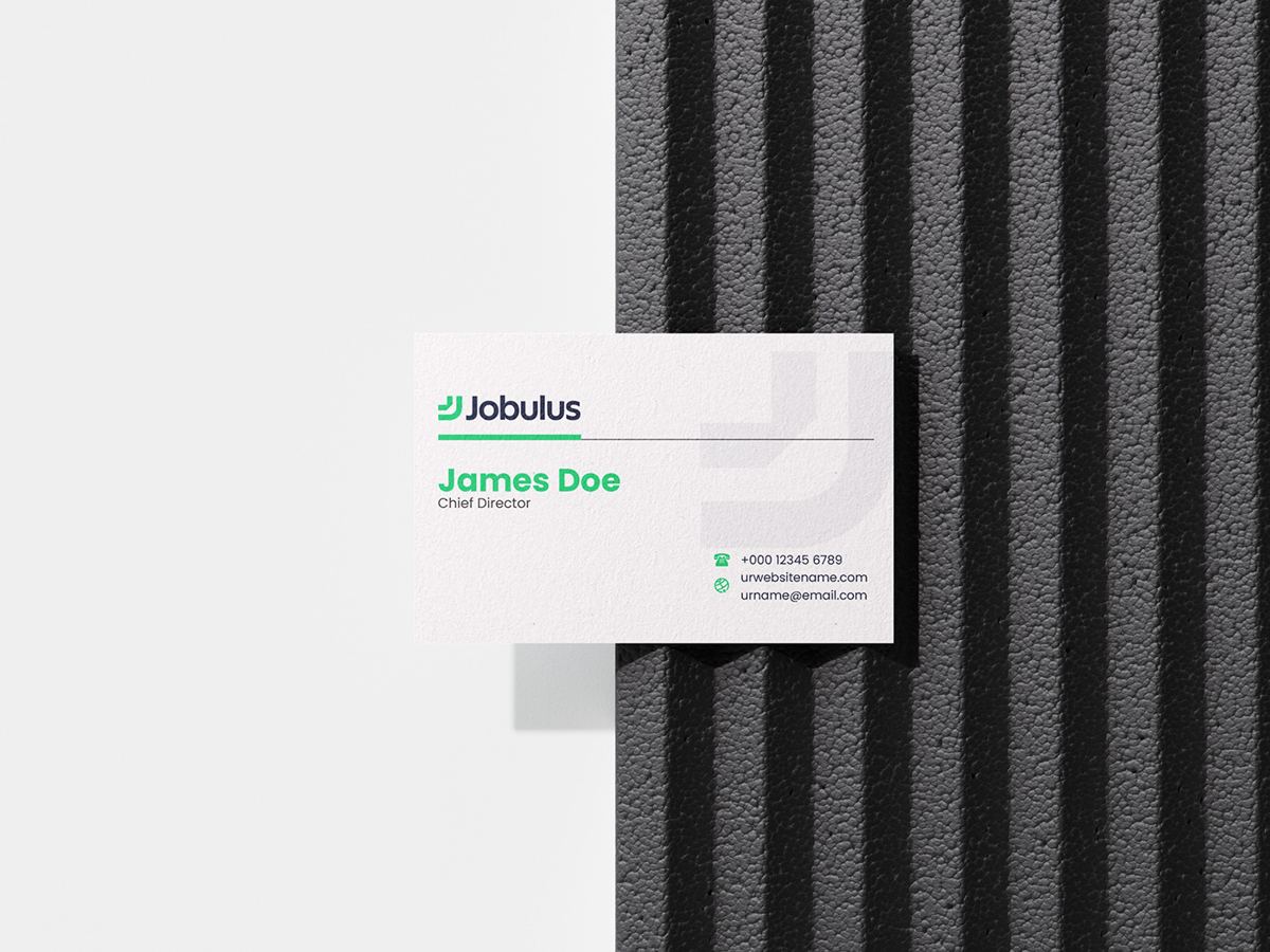
Business cards are still the most common thing exchanged at recruitment events. The Jobulus card is simple: logo at the top, name and title in Poppins, contact details below. The letterhead, envelope and notebook follow the same grid, so a welcome pack feels like one set.
Cups, mugs, bags and USB drives
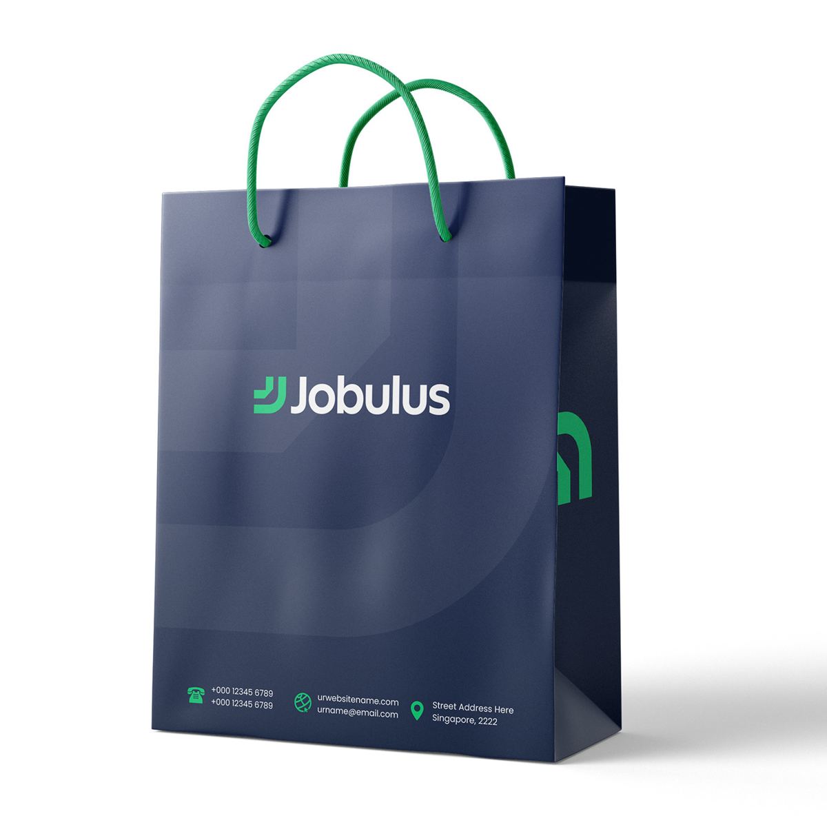
Giveaways work best when people actually use them. The Jobulus set includes:
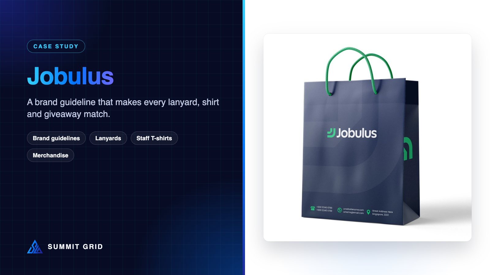
- Paper bags in navy with green handles, for collecting leaflets around a career fair.
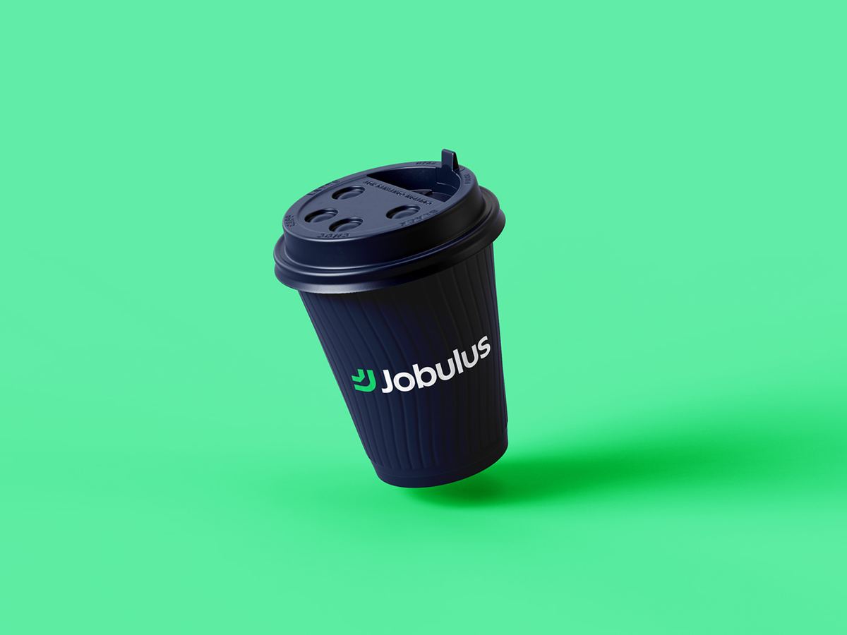
- Coffee cups and mugs with the logo, for coffee stands, office kitchens and onboarding packs.
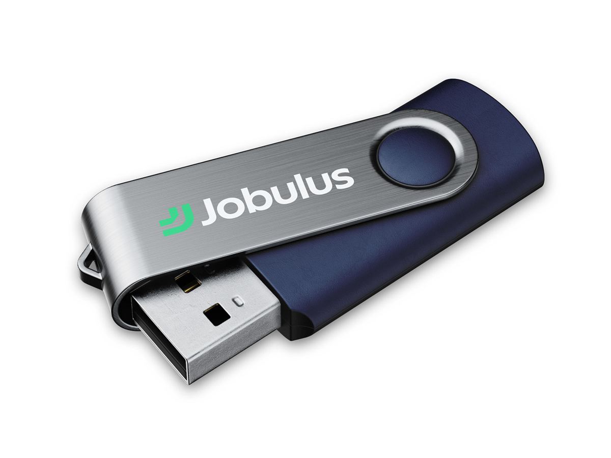
- USB drives with the logo on the metal clip, for sharing employer packs and candidate guides.
- Stickers with the logo on navy, for laptops and water bottles.
Signage
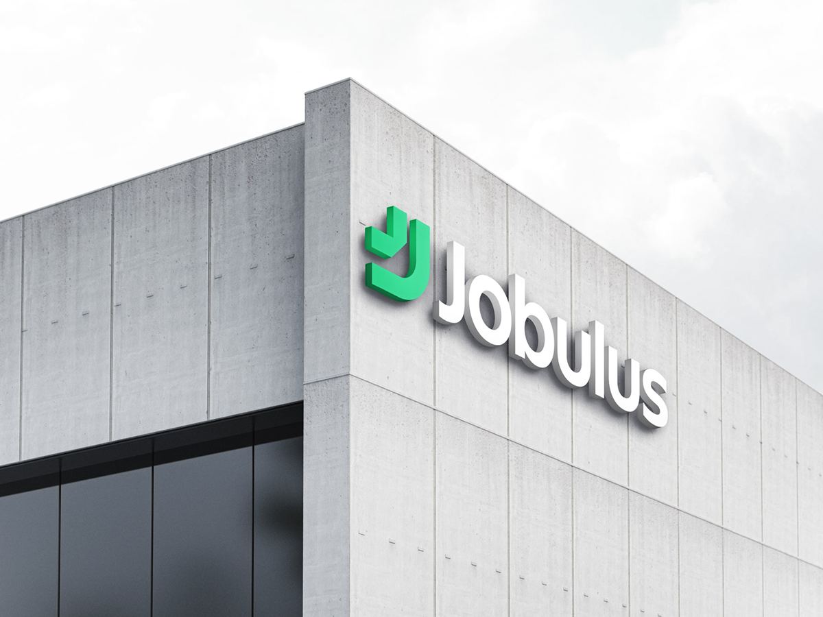
The logo was also tested at a very large size as 3D building signage. If a logo holds up on the side of a building, it will hold up on a booth wall, a stage backdrop or a large roll-up banner. If you are planning a stand, our 3D booth design service shows how the logo and message are placed for visibility.
What made this project work
- Practical rules. Safe zone, minimum size and incorrect-usage examples make the guideline easy for suppliers to follow.
- A logo for every shape. Horizontal, stacked and icon versions fit lanyards, bags and stickers without distortion.
- Exact colour values. HEX, RGB and CMYK for every colour keep the green fresh in print.
- Real examples. Showing the brand on actual items gives everyone something to copy.
Checklist: brand guidelines that work for events
If your brand guideline is mostly used by designers, it may not be ready for events yet. Check that it includes:
- Logo versions for wide, tall and small spaces.
- A safe zone and minimum size for the logo.
- Incorrect usage examples with pictures, not just words.
- Colours in HEX, RGB and CMYK, plus a Pantone reference for fabric if possible.
- Fonts that suppliers can get, or instructions to outline text in final files.
- Examples on real items: lanyards, shirts, bags, cards and banners.
Our runbook on the 4-foot visibility dead zone and our guide to CMYK rich black cover the next step: getting large event graphics right.
How to brief merchandise suppliers
A great guideline only helps if suppliers actually use it. When ordering lanyards, shirts, cups or bags for an event, send every supplier the same short brief:
- The exact colour values in CMYK, plus a Pantone reference for fabric, ceramic and embroidery.
- The right logo file for the item: horizontal for lanyards, stacked for bag fronts, icon for stickers and pins.
- The logo size and position, for example “left chest, 8 cm wide” on a T-shirt.
- The safe zone page, so nothing is placed too close to the logo.
- A request for a sample or digital proof before the full order, especially for new materials.
Asking for a single physical sample before ordering hundreds of items is the cheapest insurance you can buy. It catches colour shifts, wrong sizes and printing problems while they are still easy to fix. For large orders before a big event, leave at least two weeks between approving the sample and the event date.
Keep all of this in one shared folder: logo files, the guideline PDF, colour values and past approved samples. The next time someone orders merchandise, they start from the approved version instead of from scratch.
Frequently asked questions
What should a brand guideline include for event merchandise?
Logo versions for different shapes, a safe zone, a minimum size, colour values for print, approved fonts and examples on real items. Those are the details merchandise suppliers need.
Why do brand colours look different on merchandise?
Each material and printing method handles colour differently. Fabric, paper, ceramic and metal all behave in their own way. Exact CMYK values, Pantone references and test prints keep colours consistent.
Which giveaways work best for recruitment events?
Items people use straight away: bags for collecting leaflets, lanyards, coffee cups, notebooks and USB drives with useful content. Branded staff T-shirts help candidates find your team.
Can you turn our existing guideline into event collateral?
Yes. We take your current brand rules and design every event piece to match. See the ISEM Global Partners case study for a rebrand that became a full exhibition booth, or the cryptojobs.com case study for another recruitment brand at a major tech event.
How long does it take to create a brand guideline?
For a brand with an existing logo, a practical guideline like this usually takes two to four weeks, depending on how many applications you want to show.
See the full Jobulus brand guideline on Behance.