Exhibition Graphics Print Specs: Bleed, Resolution and Colour for SEG Fabric
Tension fabric has become the default finish for modern exhibition stands. Silicone edge graphics, usually called SEG fabric graphics, give you seamless, wrinkle-free walls, they are light to ship, and they can be swapped between shows without rebuilding the frame. They are also where a surprising amount of money is wasted.
The failures are rarely dramatic in the design file. They show up on install day: a graphic that is short on one edge, a logo that looks soft from three feet away, a brand blue that has turned purple, a “black” wall that reads as charcoal grey under hall lights. By then the fix is a rush reprint, express freight and a weaker first morning of the show.
This guide explains how SEG graphics work and how to set up files so they fit, look sharp and print in the right colour, the first time. It builds on our Trade Show Booth Design for B2B playbook.
Key takeaways
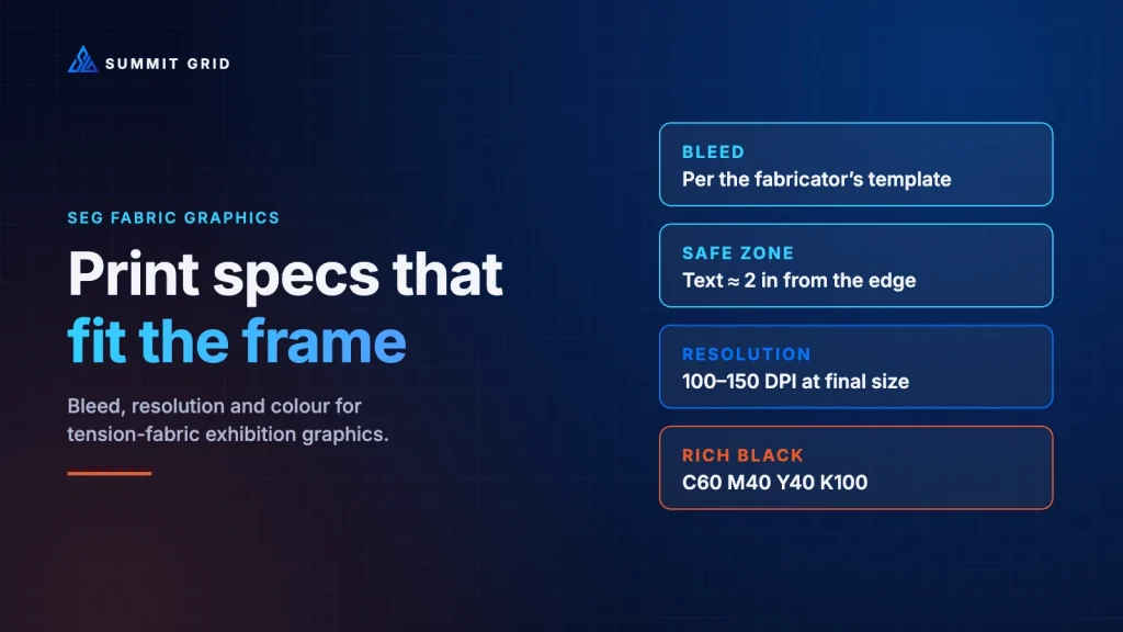
- Always build artwork to the fabricator’s template, including bleed. Never to the booth render or the “visible” size.
- Keep all text and logos inside a generous safe zone, commonly around 2 in from the finished edge.
- Resolution depends on viewing distance: most booth walls need roughly 100–150 DPI at final size.
- Define print colour values for your brand, use a proper rich black, and approve a physical strike-off.
How SEG fabric graphics actually work
An SEG graphic is a fabric print with a thin, flexible silicone strip stitched around its edges. The frame is an aluminium extrusion with a narrow channel. On site, installers push the silicone bead into that channel all the way around, which pulls the fabric taut across the frame.
Three consequences follow from that simple mechanism:
- Part of the print disappears into the channel. Fabricator guidelines typically note that 10–15 mm of the graphic is lost into the aluminium channel once the bead is inserted (SEG Solution artwork guidelines, PDF).
- The fabric is under tension. Very thin lines and small text close to edges can distort slightly.
- Printing is usually dye-sublimation. Ink is turned into gas with heat and bonded into polyester fibres. This produces rich, durable colour, but it behaves differently from paper printing, especially with deep blues, purples and blacks.
Bleed for SEG fabric graphics: the most expensive few centimetres in exhibition design
Bleed is extra artwork that extends beyond the finished edge so that nothing important is lost when the graphic is trimmed, sewn or tensioned. In SEG, bleed is not optional; it is part of how the graphic physically fits the frame.
Different fabricators ask for different amounts. One published guideline asks for at least 1 in of bleed on all sides, marked with guides or crop marks (SEG Solution). Others specify extra fabric linked to the size of the silicone bead (keder), for example about 0.4 in (10 mm) for a 10 mm bead and 0.6 in (14 mm) for a 14 mm bead (40 Visuals print file guide).
That variation is exactly why the only safe rule is: build to the template your fabricator gives you, for this specific frame. Not to the booth drawing, not to the render, and not to last year’s file for a slightly different frame.
We documented a real-world version of this failure in Three Inches Short: The Graphic That Didn’t Fit Its Frame: artwork was built to the visible face of the frame, printed, shipped, and arrived short on every side.
The three boxes every file needs
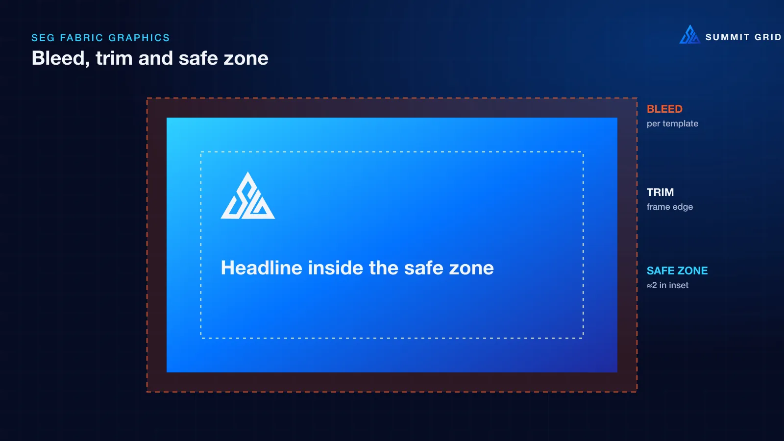
Every SEG file should clearly separate three areas:
| Area | What it is | What goes there |
|---|---|---|
| Bleed | Extends beyond the finished size | Background colour and imagery only |
| Trim / finished size | The visible edge of the frame | Nothing critical right at this line |
| Safe zone | Inset from the finished edge | All text, logos, QR codes and key imagery |
Published guidelines commonly recommend keeping key elements around 2 in (50 mm) from the finished edge (SEG Solution). On large walls we treat that as a minimum, not a target.
Units and scale: agree them in writing
Many exhibition frames are specified in feet and inches in North America and in millimetres in Europe and the Middle East. Design files are often built at a reduced scale, such as 1:4 or 1:10, to keep file sizes manageable. Both are fine, as long as everyone agrees in writing:
- the units used on the template,
- the scale the file is built at,
- and the final output size.
A file built at 1:10 and sent without a note is an invitation for someone to print it at the wrong size.
Resolution for SEG fabric graphics: how sharp is sharp enough?
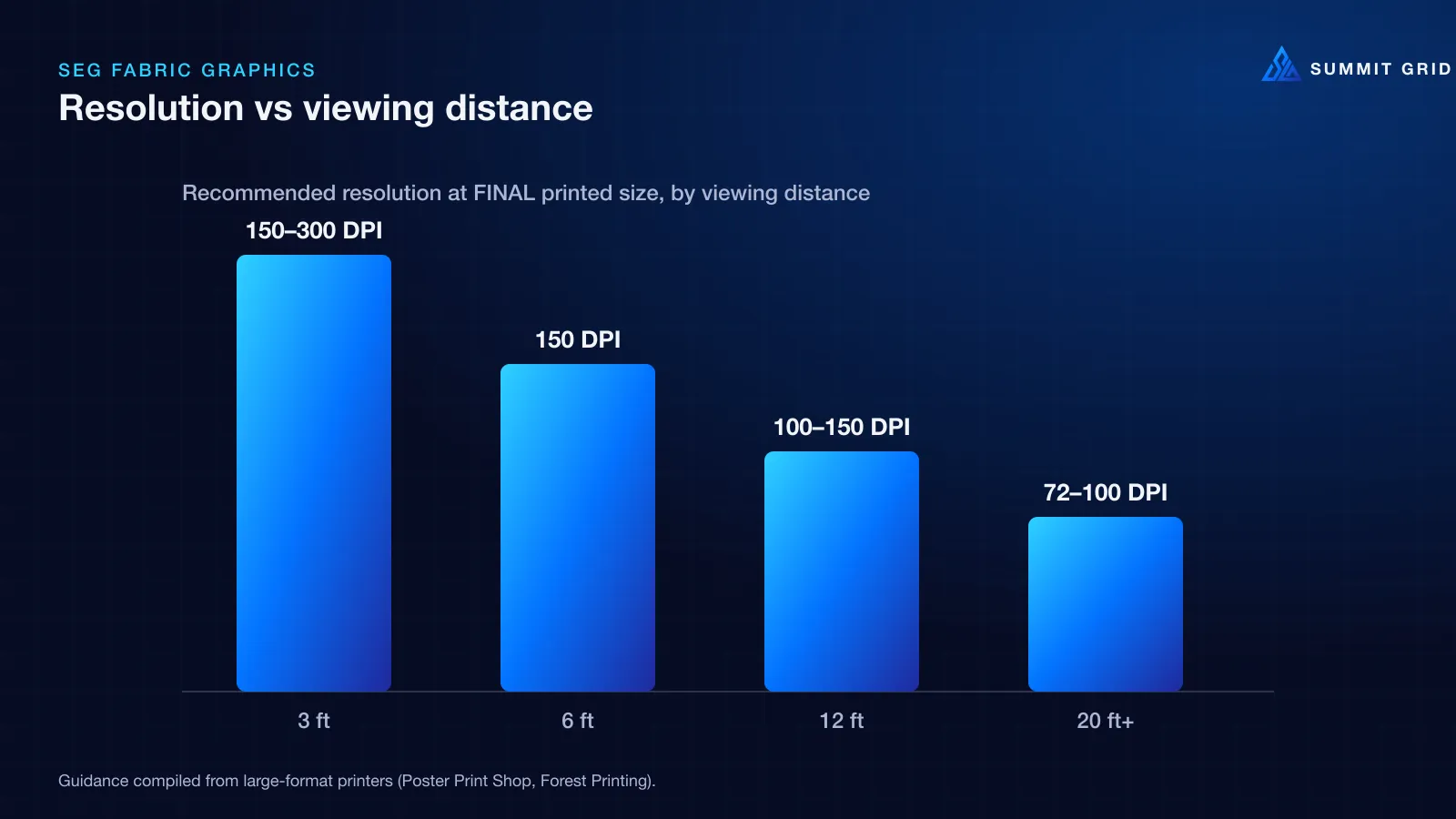
The classic “300 DPI” rule comes from print that is read at arm’s length. A booth wall is viewed from several feet away, which is why large-format printers work with much lower resolutions at final size.
Common guidance from large-format printers:
- Close viewing (under about 6 ft): 150–300 DPI at final size
- Typical booth walls and banners (about 3–12 ft): 100–150 DPI at final size
- High signage read from 20 ft or more: 72–100 DPI can be enough
(Poster Print Shop, DPI for large format; Forest Printing, DPI vs viewing distance).
Two practical checks matter more than any rule of thumb:
- Check effective resolution at final size, not in the layout. An image that is 300 DPI in a 1:10 layout file is only 30 DPI when printed at full size.
- Look at a 100% crop. Zoom to 100% at final output size on a section of the image. If it looks soft or blocky on screen, it will look worse on a lit wall.
Vector wherever possible
Logos, icons, diagrams and type should be vector, in AI, EPS, SVG or PDF format. Vector artwork is resolution-independent and will be perfectly sharp at any size. Pull logos from the brand master files, never from a website or slide deck. We explain what happens when teams skip this step in Sharp on the Laptop, Pixelated on the Wall.
Colour: why fabric changes your brand
Screens create colour with light (RGB). Printers create colour with ink (CMYK and, on some presses, extra inks). Some bright RGB colours, especially vivid blues and greens, simply cannot be reproduced exactly in print. When a file is converted automatically, the printer chooses the “closest” colour it can make, and on polyester fabric under exhibition lighting, that can be noticeably different.
We saw this in Brand Blue, Printed Purple, where a brand blue approved on screen came back violet on the finished wall.
How to protect brand colour
- Specify print values for every brand colour. Your brand guidelines should include CMYK and, ideally, Pantone references, not just RGB and hex.
- Ask for the printer’s colour profile. Convert using the profile for their press and fabric, rather than a generic setting.
- Request a strike-off. A small physical print on the actual fabric is the only reliable proof. Check it under lighting similar to the hall.
- Keep colour consistent across suppliers. If one supplier prints the back wall and another prints the counter wraps, share the same approved swatch with both.
Getting black right
Black is the colour most often wrong on show day. Artwork built with only the K (black) channel prints as a thin layer of ink that can look flat and grey on fabric. Fabricator guidelines recommend a rich black built from all four channels. One published spec, for example, lists True Black as C60 M40 Y40 K100 (SEG Solution). This is the same recipe we explain in CMYK Rich Black: The $15,000 Venue Reprint Trap.
Two cautions:
- Keep small body text in 100% K only. Rich black on fine type can mis-register and look fuzzy.
- Confirm the total ink limit with your printer before locking the file.
File delivery: what a fabricator-ready file looks like
A clean handoff saves days of back-and-forth. Typical requirements include:
- Format: high-resolution PDF, one graphic per page, at the agreed scale.
- Colour mode: CMYK, with Pantone spot colours named clearly if used.
- Fonts: outlined or fully embedded.
- Images: embedded, not linked.
- Guides: bleed, trim and safe zone clearly marked, or crop marks included.
- File naming: frame reference, panel number, size and version, for example
ISLAND-BACKWALL-P2_2400x3000mm_v3.pdf. - Proof sheet: a small overview showing where each panel sits on the stand.
Many fabricators publish their own preparation guides. Always use theirs as the final word (SEG Solution guidelines; Colour Graphics, tension fabric systems explained).
Special cases worth planning for
Backlit SEG. Lightboxes use a different fabric and often need adjusted colour, because light passes through the print. Dark areas can look muddy and light areas can wash out. Ask for a backlit strike-off.
Double-sided graphics. Hanging signs and freestanding towers are often seen from both sides. Check whether the fabric has a blockout layer so one side does not show through the other.
Seams on very large walls. Fabric widths are limited. Very large graphics may be sewn from several panels. Ask where seams will fall and keep faces, text and logos away from them.
Multi-show reuse. If you plan to reuse graphics, choose content that will not date quickly, and store fabric rolled or folded according to the supplier’s advice to avoid creases.
SEG fabric graphics vs other exhibition graphics
SEG is not the only option, and it is not always the right one. Understanding the alternatives helps you choose the right finish for each part of the stand:
| Graphic type | Strengths | Watch out for |
|---|---|---|
| SEG fabric graphics | Seamless large walls, light to ship, reusable frames, rich colour | Bleed and template accuracy, colour shift on fabric, seams on very large walls |
| Pillowcase / push-fit fabric | Quick to install on simple frames, low cost | Less crisp edges, can wrinkle, limited to certain frame shapes |
| Rigid panels (foamboard, dibond, acrylic) | Very sharp detail, good for close-up content and counters | Heavier to ship, can scratch or dent, less reusable |
| Vinyl wraps | Ideal for counters, plinths and curved surfaces | Needs clean, smooth surfaces; air bubbles and edges need skilled installers |
| LED screens | Motion, product UI and changing content | Cost, power, content legibility at distance |
Most modern stands combine several: SEG fabric graphics for the big brand walls, rigid or vinyl graphics for counters and close-up details, and LED for motion. The rules in this guide apply most directly to SEG, but the same discipline, including templates, safe zones, resolution checks and colour control, applies to every printed surface.
A pre-flight checklist for SEG fabric graphics
Run every file through this list before it leaves your hands:
- Built to the fabricator’s current template for this exact frame
- Units and scale confirmed in writing
- Bleed on all sides, as specified by the fabricator
- All text, logos and QR codes inside the safe zone
- Effective resolution checked at final size (typically 100–150 DPI for walls)
- Logos and type are vector
- Brand colours defined in CMYK/Pantone; printer’s profile used
- Rich black used for large dark areas; 100% K for small text
- Fonts outlined, images embedded, files named clearly
- Physical strike-off approved for key colours
- Proof sheet showing panel positions sent with the files
Frequently asked questions
How much bleed do SEG fabric graphics need?
It depends on the fabricator and the size of the silicone bead. Published guidelines range from around 0.4–0.6 in linked to bead size, to at least 1 in on all sides. Always use your fabricator’s template.
What resolution should trade show graphics be?
For most booth walls viewed from a few feet away, roughly 100–150 DPI at the final printed size is enough. Close-up graphics need more; high signage read from far away can use less.
Why does my black look grey on fabric?
Black built from only the K channel prints as a thin layer on polyester fabric. A rich black that adds cyan, magenta and yellow, such as C60 M40 Y40 K100, looks deeper. Check the total ink limit with your printer.
Can I send my graphics as RGB files?
Some printers accept RGB and convert it themselves, but you lose control of the result. Converting with the printer’s own profile and approving a strike-off is far safer.
How far in advance should graphics be finished?
Allow time for proofing and strike-offs, production and freight. For custom stands, many teams aim to have final files approved several weeks before shipping. Your fabricator can give you their exact lead times.
Not sure your files are ready? Request a Print File Pre-Flight / CMYK Check and we will audit every panel against your fabricator’s template before you pay for a single metre of fabric.