Right Education: Education Fair Stage, Banners and Social in One Look
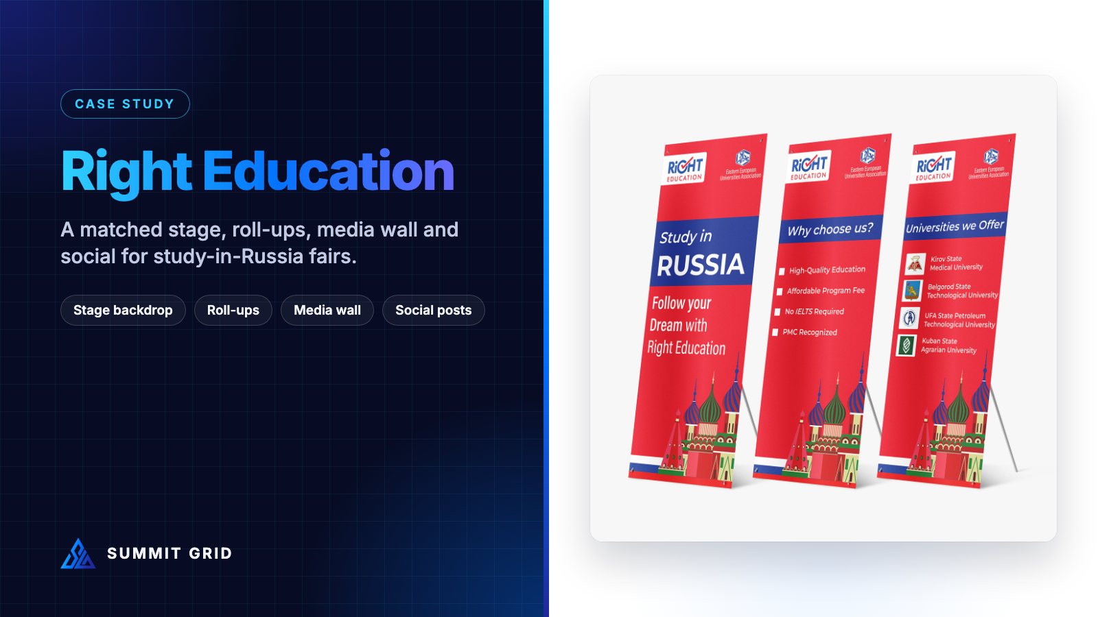
Right Education helps students from Pakistan study medicine and other degrees at universities in Russia. Their events, from education fairs to seminars and admission drives, need to build trust quickly with students and parents. This case study shows how one simple visual system tied together the stage, the banners, the media wall, the flyers and the social posts.
| Client | Right Education (study abroad consultancy) |
| Focus | Study in Russia: MBBS / MD and other degree programmes |
| Scope | Logo, stage backdrop, roll-up banners, step-and-repeat media wall, flyer, website banner, social media posts |
| Brand colours | Red, blue and white |
| Designer | Muhammad Awais Shabbir, Summit Grid |
The challenge: earning trust in a crowded education market
Studying abroad is a big decision for a family. Students and parents compare many consultancies, often at the same education fair, on the same day. They are looking for signs that a company is real, authorised and organised.
Design plays a bigger role in that judgement than most people expect. A consultancy with mismatched banners, blurry flyers and a different look on every social post feels less trustworthy, even if its service is excellent. A consultancy whose stage, banners and printed material all match looks established and professional.
Right Education needed a look that would:
- Show the study-in-Russia focus instantly, without long explanations.
- Put the official authorisation by the Eastern European Universities Association (EEUA) front and centre, because that is the trust signal parents look for.
- Work the same way on a stage, a roll-up banner, a flyer and a phone screen.
Step 1: a logo with a built-in tick
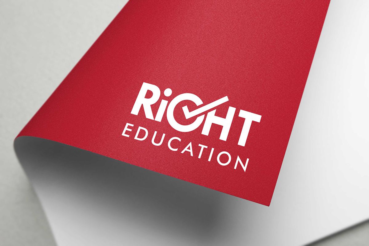
The name already carries the promise, so the logo keeps it simple. The “G” in RIGHT is shaped like a tick mark: the universal sign for “correct”. It is bold, easy to read at a distance, and works in white on red, red on white, or on blue.
We prepared colour versions for red, blue and white backgrounds, because education fairs, stages and social posts all use different backgrounds, and the logo has to stay clear on all of them.
Step 2: a colour story with meaning
The red, blue and white palette echoes the colours of the Russian flag. The illustration of colourful onion domes, inspired by Moscow’s famous skyline, appears across the materials. Together they tell the audience “study in Russia” before they read a single word.
That kind of visual shortcut is valuable at events. Most visitors walk past a stand or stage in a few seconds. If the colours and the illustration already explain your offer, the words only need to confirm it.
As with every project, the colours were written down in screen and print values and shared with every printer. Large red areas, like the stage backdrop and roll-ups, show colour differences clearly, so a shared colour spec was essential. Our post-mortem on colour shift in print shows what can go wrong without one.
Step 3: the stage backdrop
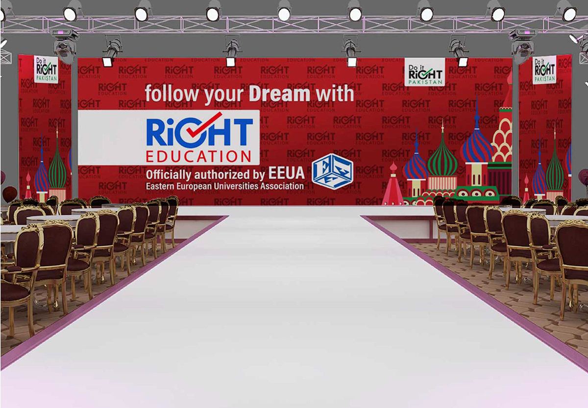
The stage is where seminars, university presentations and admission announcements happen, and it is also the background of almost every photo taken at the event. That makes it the most-photographed piece of branding Right Education owns.
We designed the stage as three layers:
- A centre panel with the main message, “follow your Dream with Right Education”, the logo, and the line “Officially authorized by EEUA, Eastern European Universities Association” with the EEUA logo.
- Side panels with the onion-dome illustration, so the Russia story is visible from every angle.
- A repeating logo pattern across the rest of the wall, so the brand appears in every photo, even close-ups of speakers.
Text on the stage is short and large. Anything smaller would be unreadable from the back rows, and would disappear in photos.
Step 4: roll-up banners that answer the key questions
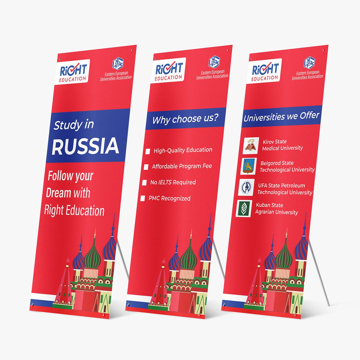
At education fairs, families ask the same three questions again and again. We designed one roll-up banner for each:
- “Study in RUSSIA: Follow your Dream with Right Education”: the headline offer.
- “Why choose us?”: short points like high-quality education, affordable programme fees, no IELTS required and PMC recognised.
- “Universities we offer”: partner universities with their crests, such as Kirov State Medical University, Belgorod State Technological University, Ufa State Petroleum Technological University and Kuban State Agrarian University.
Placed side by side, the three banners work like a short presentation that visitors can read in order. Placed separately, each one still makes sense on its own. The logo sits at the top of each banner, above head height, where it can be seen over the crowd. Our runbook on the 4-foot visibility dead zone explains why that placement matters.
Step 5: the step-and-repeat media wall
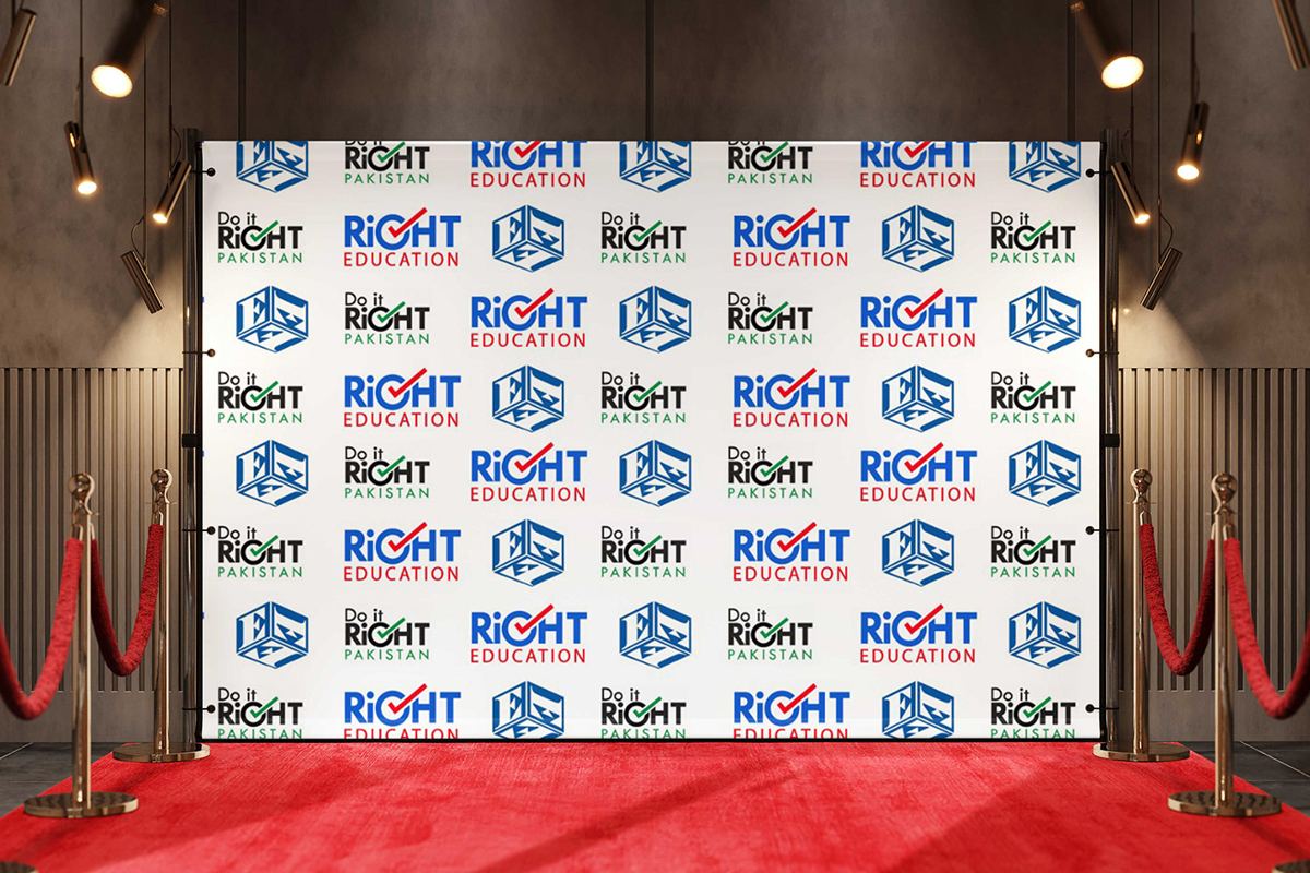
A step-and-repeat wall is the backdrop people pose in front of: students who have just been accepted, visiting university staff, guests and partners. Those photos get shared on social media, which means the wall keeps working long after the event ends.
We arranged the logos in a tight, alternating grid so that at least one full logo appears in any photo, whether it is a full-length group shot or a close-up of one person. The white background keeps the logos sharp and makes faces easy to light.
Step 6: flyers and the website banner
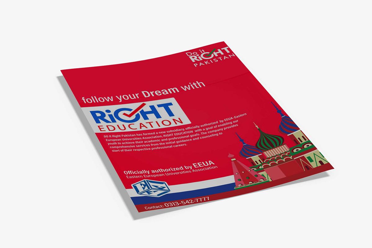
The take-home flyer repeats the main stage message, the EEUA authorisation and a phone number. Keeping it short means parents can read it on the way home and still remember the key facts.
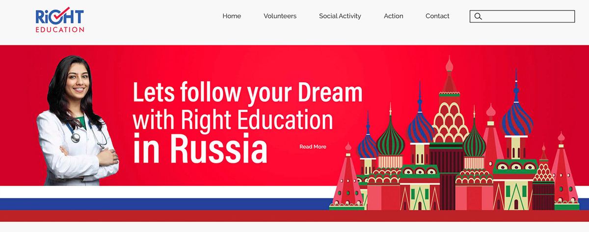
After the event, many families visit the website to check the company out. The website banner uses the same red background, the same onion-dome illustration and the same message as the stage, so returning visitors immediately know they are in the right place.
Step 7: social posts for admissions season
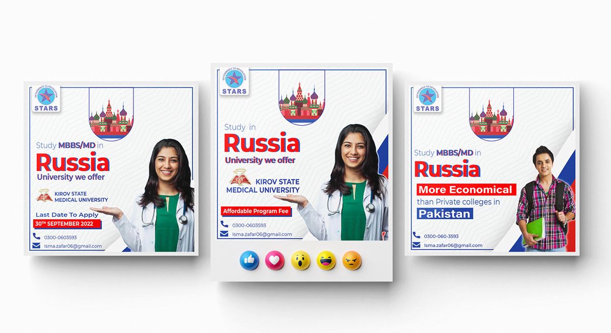
Social media is where most students first hear about Right Education. We built a reusable post template for programme announcements, university features and application deadlines. Each post uses the same structure: university name, programme, key benefit, deadline and contact. That makes posts fast to produce and easy to recognise in a busy feed.
What made this project work
- Trust signals up front. The EEUA authorisation appears on the stage, banners and flyer, not hidden in small print.
- Visual shortcuts. Colours and illustration explain “study in Russia” in a second.
- Answer the real questions. Each roll-up answers one question families actually ask.
- Design for photos. The stage and media wall keep the brand in every picture shared after the event.
Checklist: branding for education fairs and seminars
- Put your authorisation or accreditation on every major piece.
- Use one main message across stage, banners, flyer and website.
- Plan three roll-ups: what you offer, why you, and proof (universities, results, partners).
- Add a step-and-repeat wall if you expect photos with students or guests.
- Keep flyers short: message, proof and contact.
- Share one colour spec with every printer.
For larger stands and stages, our 3D booth design service plans how visitors move through the space and where they see each message.
Sizes and specs for education fair materials
These are the common sizes for the materials in this project. Always confirm exact sizes with your venue and printer before sending files.
| Item | Common size | Tip |
|---|---|---|
| Stage backdrop | Often 6 to 12 m wide, 3 to 4 m high | Keep the main message in the upper middle so it is visible over the speaker and in photos. |
| Roll-up banner | 85 × 200 cm | Logo in the top 40 cm; avoid key text in the bottom 20 cm. |
| Step-and-repeat wall | Often 2.4 × 2.4 m or 3 × 2.4 m | Repeat logos every 30 to 40 cm so every photo crop includes one. |
| Flyer | A5 or A4 | One message, one proof point, one contact method. |
| Social post | 1080 × 1080 or 1080 × 1350 px | Deadlines and university names large enough to read on a phone. |
Large prints like stage backdrops are usually printed on fabric or flex vinyl. Both need the right resolution and bleed. Our post-mortems on pixelated artwork and wrong-size fabric graphics explain the most common problems.
Common mistakes at education fairs
- Too much text on banners. Families walk past quickly. Three short points beat ten long ones.
- Hiding the accreditation. Official approvals are the strongest trust signal you have. Put them where people look first.
- Different looks for stage, stand and social. When materials do not match, families struggle to remember which consultancy they spoke to.
- No plan for photos. Events generate dozens of photos. Without branded backdrops, most of them show nothing about your brand.
- No follow-up path. A QR code to a registration or WhatsApp contact turns interest into a conversation.
How to measure an education event
We do not publish client numbers here, but these are the measures we recommend tracking after any education fair or seminar:
- Registrations or enquiries collected during the event, ideally through a QR code form.
- Photos shared by students and guests that show the backdrop or media wall.
- Website visits in the week after the event, compared with a normal week.
- Applications started by students who attended.
Frequently asked questions
What should a study abroad consultancy bring to an education fair?
A clear backdrop or stand with your logo and main message, two or three roll-up banners, a short flyer, branded staff, and a way to collect contact details, like a QR code to a registration form.
What is a step-and-repeat banner?
It is a backdrop printed with a repeating grid of logos, used for photos and interviews. The repeat makes sure the logos appear in every photo, whatever the crop.
How do I make my education brand look more trustworthy?
Show official approvals clearly, keep every material in the same colours and fonts, and avoid crowded designs. Consistency signals organisation, and organisation signals trust.
Can you design our event materials and social posts together?
Yes. Designing them together is what keeps them matching. See our event collateral and media services, or read the ISEM Global Partners case study, another education brand.
How big should the text be on a stage backdrop?
Big enough to read from the back row. As a simple rule, the main headline should be at least 15 to 20 cm tall on a medium stage, and the logo even larger. If you are not sure, print a small section at full size and check it from the back of a similar room.
Should social posts look the same as the event materials?
Yes. Many families see your social posts first and the stage or stand later. When both use the same colours, logo and message, people recognise you instantly at the event, and that recognition builds trust.
See the full Right Education project on Behance.